Original document menu
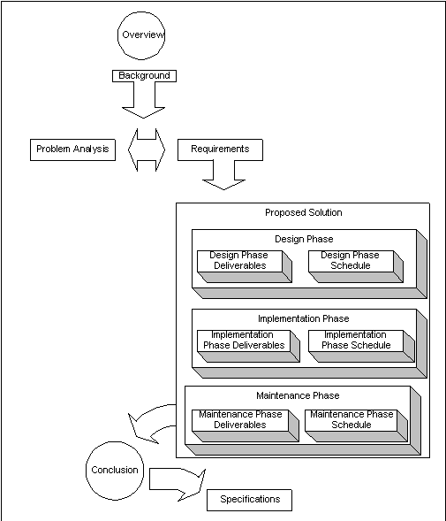
Overview
Background
Problem
Analysis
Requirements
Proposed
Solution
Design Phase
Design Phase
Deliverables
Design Phase
Schedule
Implementation
Phase
Implementation
Phase
Deliverables
Implementation
Phase Schedule
Maintenance
Phase
Maintenance
Phase
Deliverables
Maintenance
Phase Schedule
Conclusion
Specifications
Revised document menu
as clickable image map
Example: IBM
Investors
Financials

You have
chosen Investors,
then Financials.
The dropdown menu
on the left
highlights your
location.
When you show
the choices made,
from the top
level to this
level, users know
at a glance how
they got here—or
how they would
have gotten here
if they had
walked down the
staircases from
the top level,
rather than
making a
hyper-jump here.
The menu, acting
as an object map,
re-enforces their
sense of knowing
where they are;
of navigating
through a stable
structure.
Example:
Yahoo! Directory
breadcrumbs
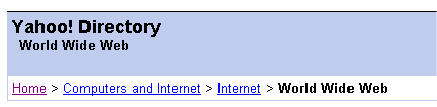
Breadcrumbs
show you where
you are in the
dominant
hierarchy.
Example: Dean
and Deluca
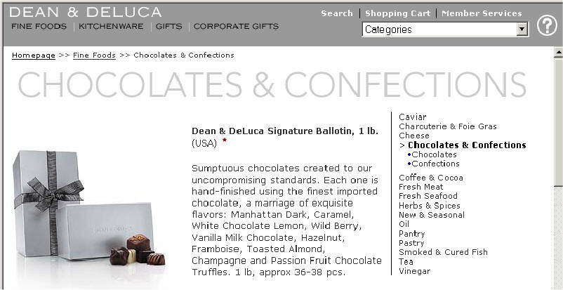
Breadcrumbs just under the
banner at the top show the
path from the home page. On
the right, an alphabetical
menu shows the categories
under Fine Foods, emphasizing
this section, Chocolates and
Confections. Neither goes
below the subcategory, to
confirm arrival at the
product page, which is
devoted to the Ballotin.
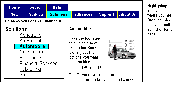
Example: Inktomi
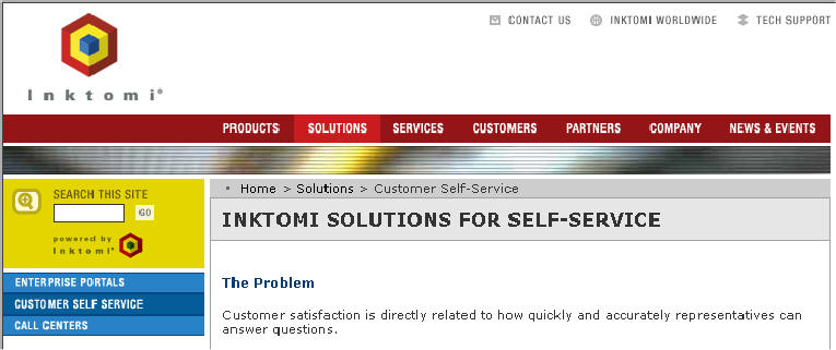
The breadcrumbs, above the
major heading for this page,
indicate the path from the
top, although the last item
does not match the heading.
In addition, the SOLUTIONS
menu item is highlighted, and
on the left, the subtopics
within Solutions show up,
with the current one
selected. Of course, Customer
Self-Service, the menu item,
does not match "Inktomi
Solutions for Self Service."
These inconsistencies may
raise some doubt as to
whether the customer has
actually arrived at the
intended page.
Original Navigation
Bar & Menu for
Departments Page
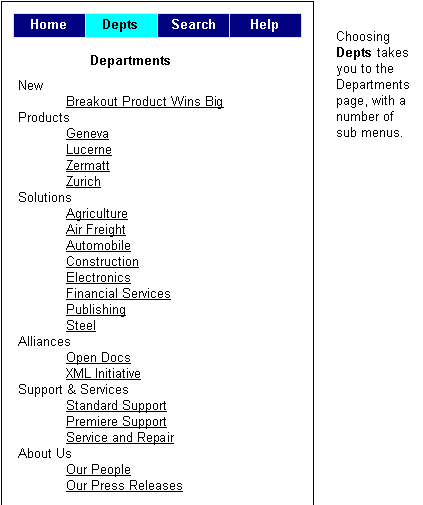
None of these submenus
was visible from the home
page. You had to guess that
Depts would open up a page
with all this content.
The home page shows only
the top menu bar, with
Home, Depts, Search, and
Help. Not very revealing.
Revised Navigation

